Wepresent by Wetransfer
Wetransfer asked three designers to work on their magazine Wepresent. In a Raymond Quenau manner, each of us worked with the same content and three different magazines went to print in the end. It worked like a pitch where everybody wins. The other two versions were designed by Seri Tanaka and Chloe Scheffe.
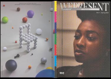
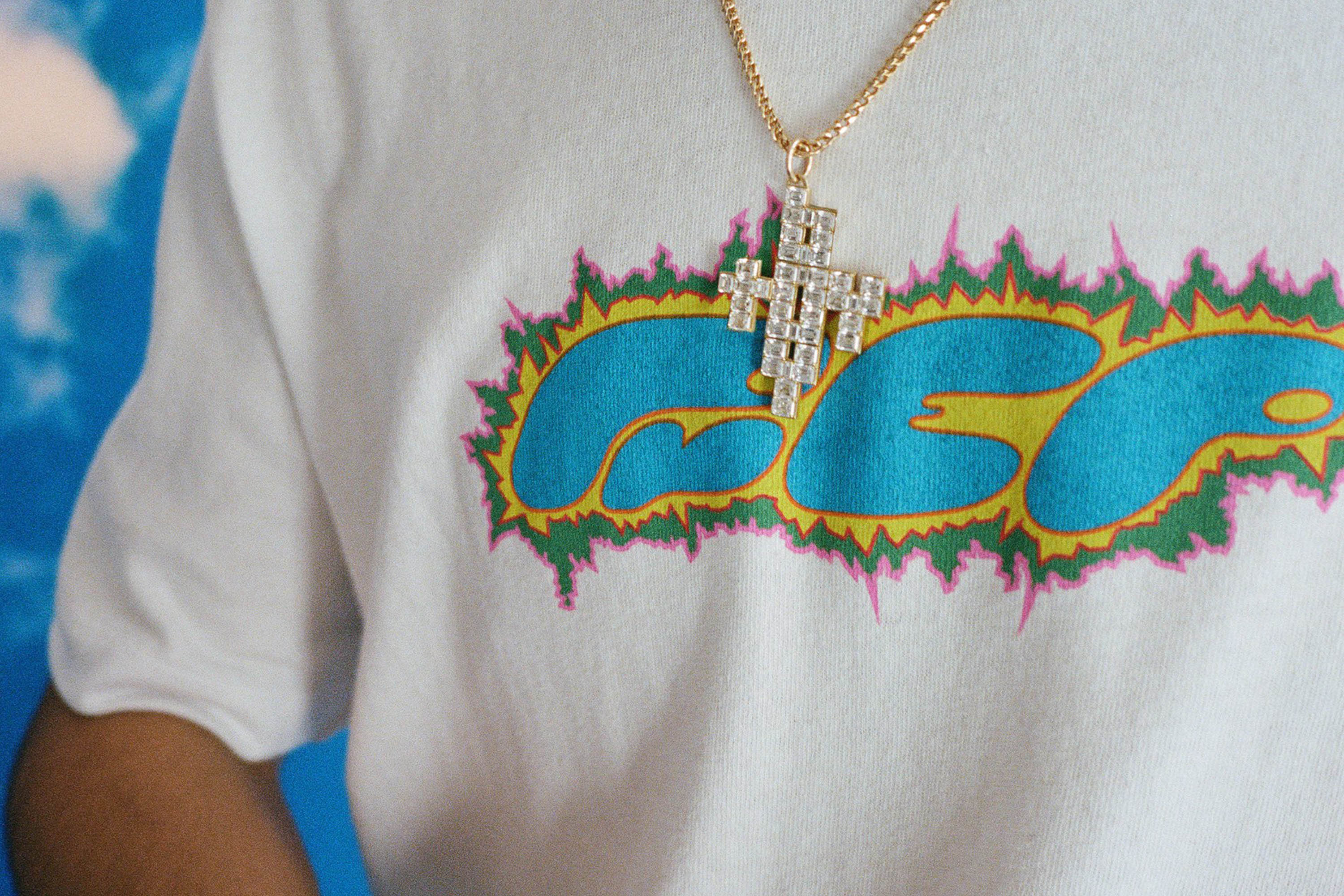
Little Simz starred on the cover of the magazine. Back cover featured an ad (shot by Klemen Ilovar) for my chair that was about to go to production at that time
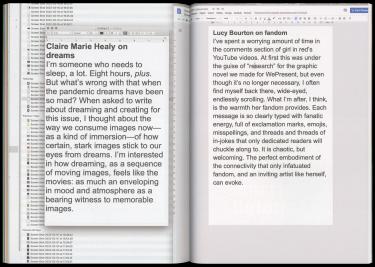
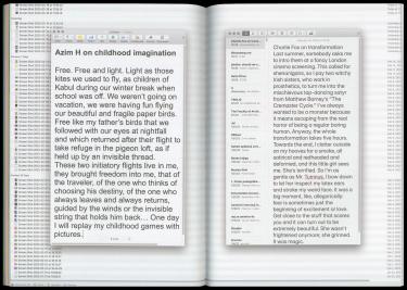
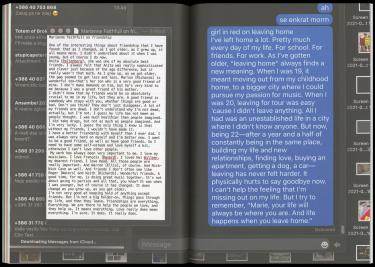
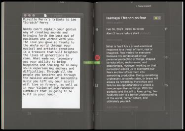
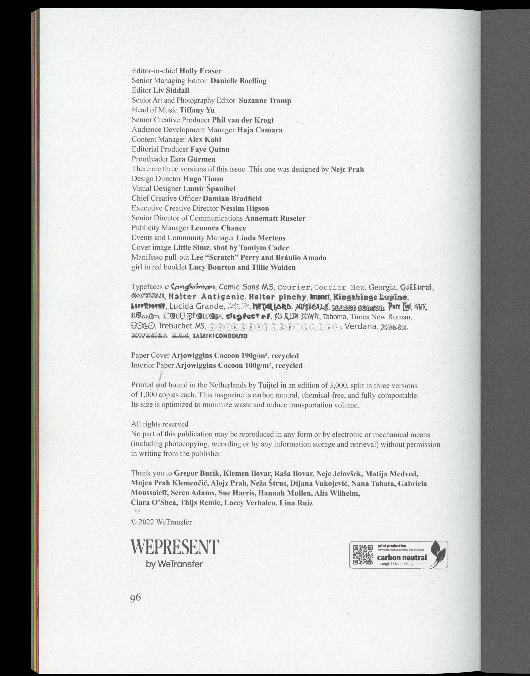
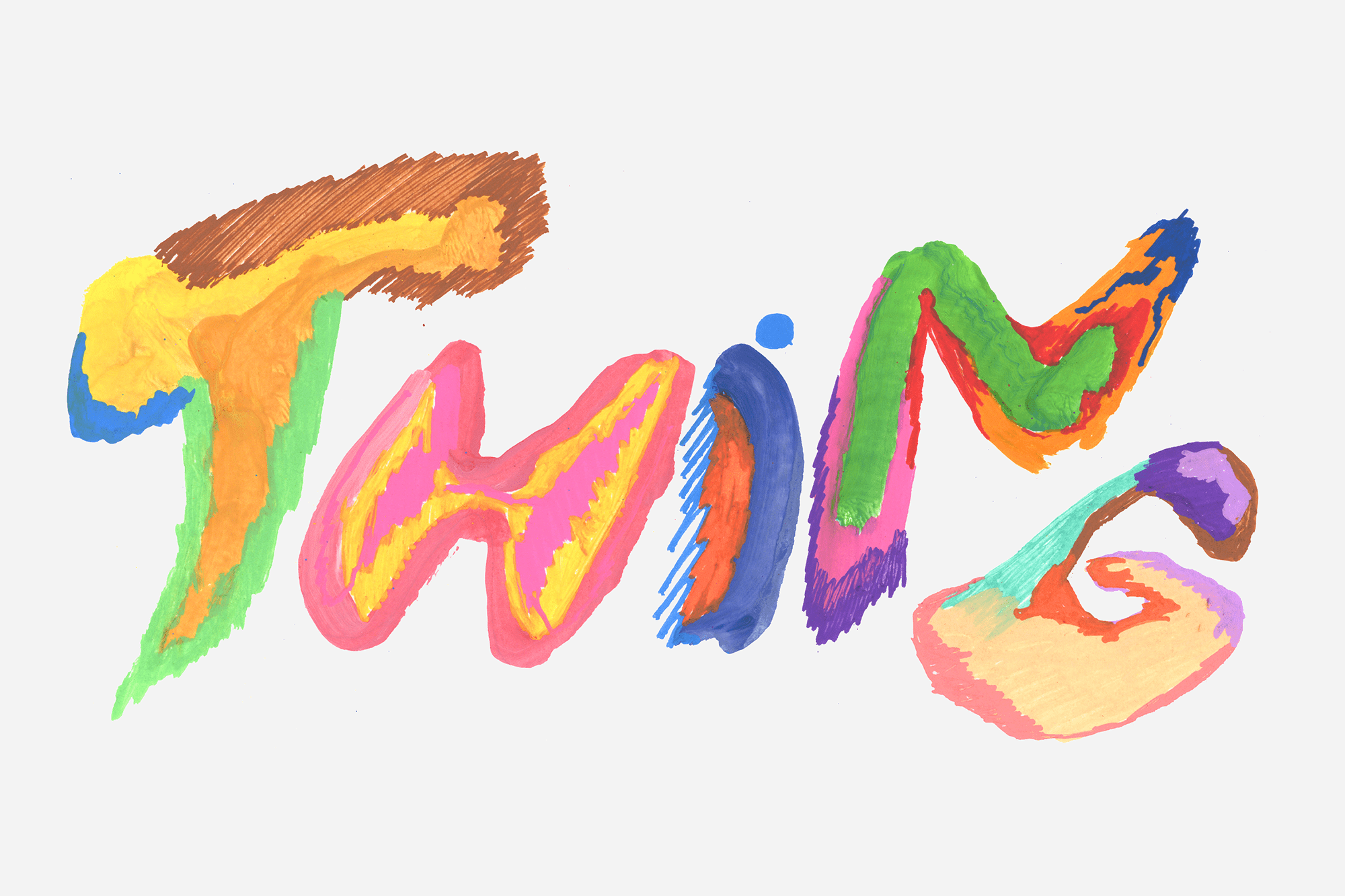
Display fonts are downloaded from various free font websites, most notably fontspace, while the rest is set in Times New Roman and occasional system fonts (Verdana, Lucida, Courier, Arial, Georgia, Comic Sans…). There is also a bit of interface typography, with screenshots from Notes, iMessages, Calendar, TextEdit, Preview and Google Docs. Some of the texts are written by hand, most notably by my dad, there is also one by my friend Nejc and myself.
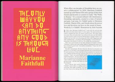
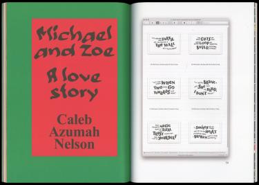
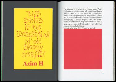
Opening spreads with a variety of free commercially available fonts found online
The first few pages are dedicated to “1:1.618”, a photo essay by Klemen Ilovar. His essay is a nod to the countless golden section explanations that find the ratio everywhere: in human ears, sea shells or the curvature of the chameleon’s tail. He found objects and details that fit right into the ratio and into the magazine grid. From an old radiator to a famous modernist building in Ljubljana, the 1:Φ ratio does seem to be all around us.
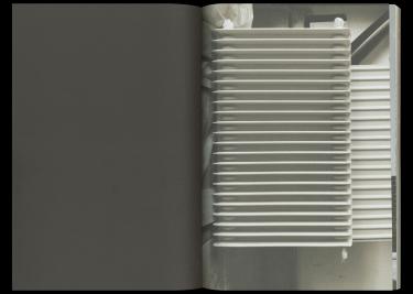
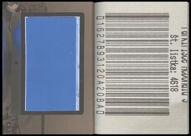
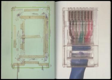
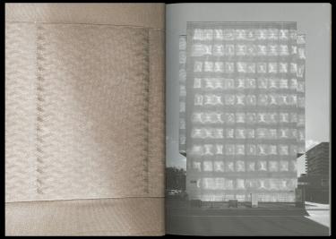
Photo essay by Klemen Ilovar
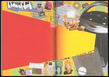
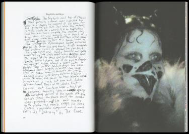
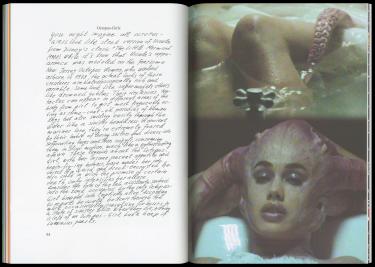
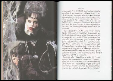
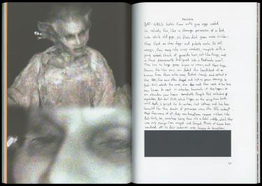
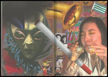
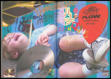
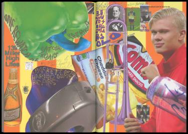
A list-article by Japanese Breakfast was transformed into a series of collages at the very end of the magazine
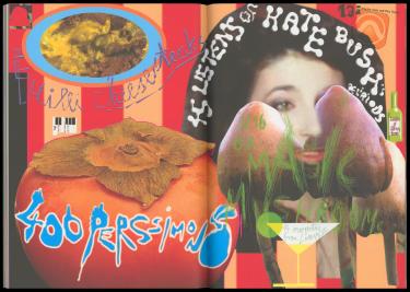
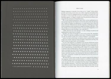
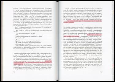
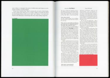
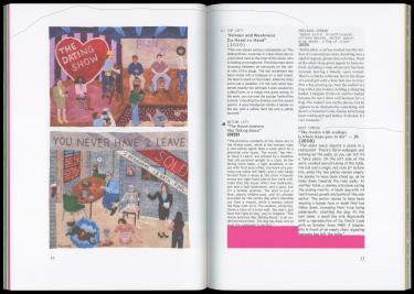
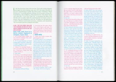
When the text didn't fit the grid, color blocks were used to fill the empty space
I used a traditional grid, a book layout where the proportions of the text block are in the golden ratio, and the ratios between margins multiply by phi (1.618). I found the recipe in one of the books about classic typography. It’s a weird corner of design, presenting itself as mathematic and rational, a rare overlap of beauty and reason, but it mostly just feels very esoteric and mystical, almost like reading horoscope or watching the Da Vinci code.
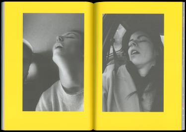
Following an article about dreams by Claire Marie Healy, Klemen Ilovar and I worked on a photo essay about dreams, pulling images from our iPhone libraries
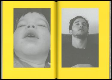
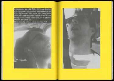
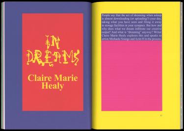
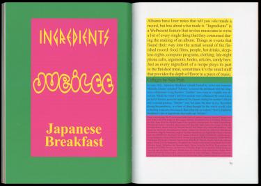
I used primary, secondary and tertiary color combinations with different combinations of 100% ink coverages (100/100/0/0 or 0/100/100/0…). When the text couldn’t fill out the grid, color blocks were used to fill the empty space.
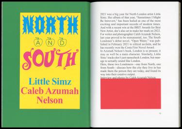
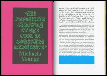
I used primary, secondary and tertiary color combinations with different combinations of 100% ink coverages (100/100/0/0; 0/100/100/0…)
